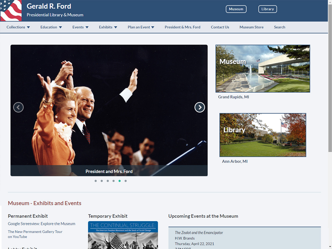
Site Design: The front-end interface presents an inviting, visual interface to users with an easy to follow structure for exploring the museum and library plus accessing event calendars, online exhibits and archival content.
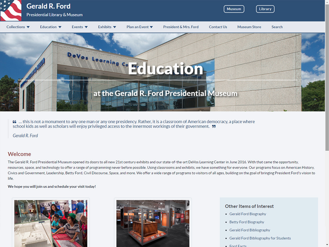
Education Center: A subsequent collaborative project with the museum team to arrange content to fit within the site's structure and incorporate photo elements that visually enhance the appeal to site visitors.
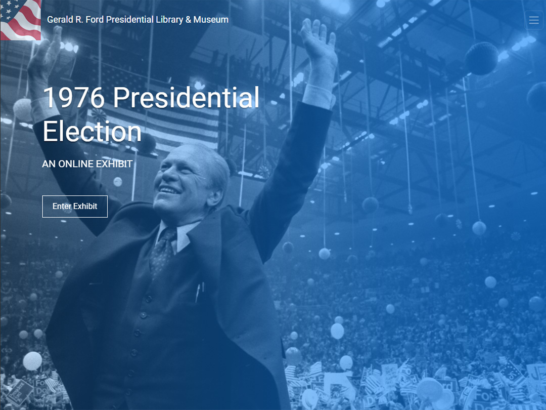
1976 Presidential Election: A soon-to-be launched online exhibit with a responsive design that will display and function well on any device type: smartphone, tablet, laptop or desktop.
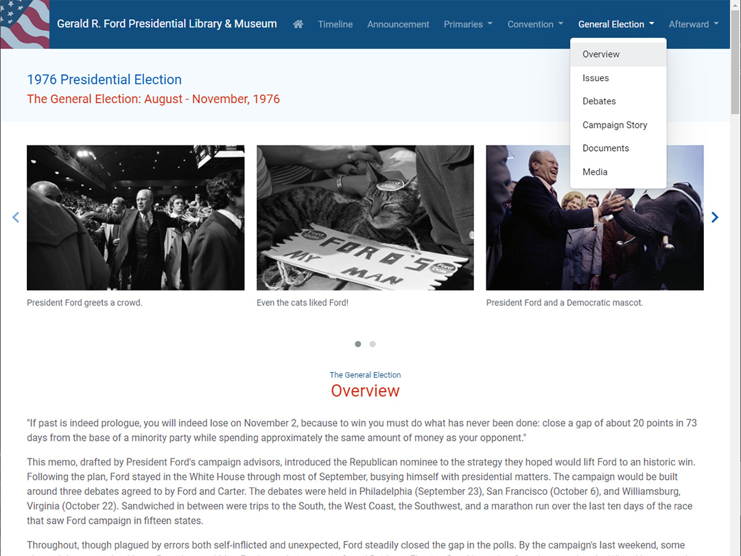
Tiered Exhibit Content: Menus provide a structure for users to easily traverse the large amount of site content and quickly select and link to those specific aspects of the campaign they want to explore more.
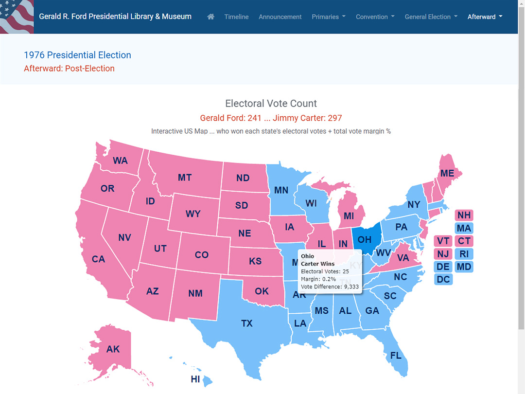
Interactive Map: A dynamic data-driven map that allows users to view electoral data results by state and that highlights how close the final vote count was in the 1976 presidential election.
Taking The Seas: My first online exhibit for the museum, which focuses on American aircraft carriers, provides another example of a clean, visual approach for handling a large amount of content.
Gerald R. Ford Presidential Library & Museum
- Museum Website:: fordlibrarymuseum.gov
- 1976 Presidential Election Exhibit:: Coming Soon
Several years ago, the Gerald Ford Museum contacted me and asked me to help them upgrade their site. The scope of this site is very large, containing a ton of archival content, so the task seemed a bit daunting at the start. After an in-depth analysis of site content, we determined that a huge improvement could be gained by focusing our resources on what we tagged as the main front-end content on the site. This allowed us to prioritize our design on making improvements to the interface structure, display and overall user interface for the information that is viewed by the vast majority of site visitors.
A Closer Look ...
At the beginning, the project started out as an exercise in content management. We needed to determine how all the content we wanted to include in our design fit together in a cohesive and understandable manner. We decided right upfront to create a working design prototype that provided the museum team an ongoing reference for how new site would look and function. Just as important, they could review the prototype to ensure that we were handling/covering all necessary content. The end result was a complete new front-end site design with a more structured and inviting interface, improved color usage, more imagery and an easier indexing methodology to older archival content. As part of the design, we also included new event calendars and more online exhibit content.
Responsive and ADA Compliant Site
Once the development phase began, there were two other key components that had to be factored into the new site deisgn. The first is that the site needed to be responsive so that users on any device type (phone, tablet, laptop or desktop) would have a good experience. The second is that multiple accessibility factors (e.g. color contrast, alt tags, etc.) had to be designed for as as all National Archives and Records Administration (NARA) sites must be accessible (ADA compliant). Accessibility is an important element of design that many website designers do not consider and can present a host of design compromises.
Education Center - Site Addition
A year after the new site design was launched to the public, we came back in and added an entire new Education section to the site for the DeVos Learning Center. This effort was a much faster process as our partnership allowed us to leverage all the work from our earlier design. In fact, the larger share of the effort for this project involved collaborating with the museum team to arrange their content to fit nicely within the new museum site structure. While textual copy is key for this portion of the site, we found ways to incorporate visual elements and imagery so that it is visually appealing for site visitors.
Online Educational Exhibits
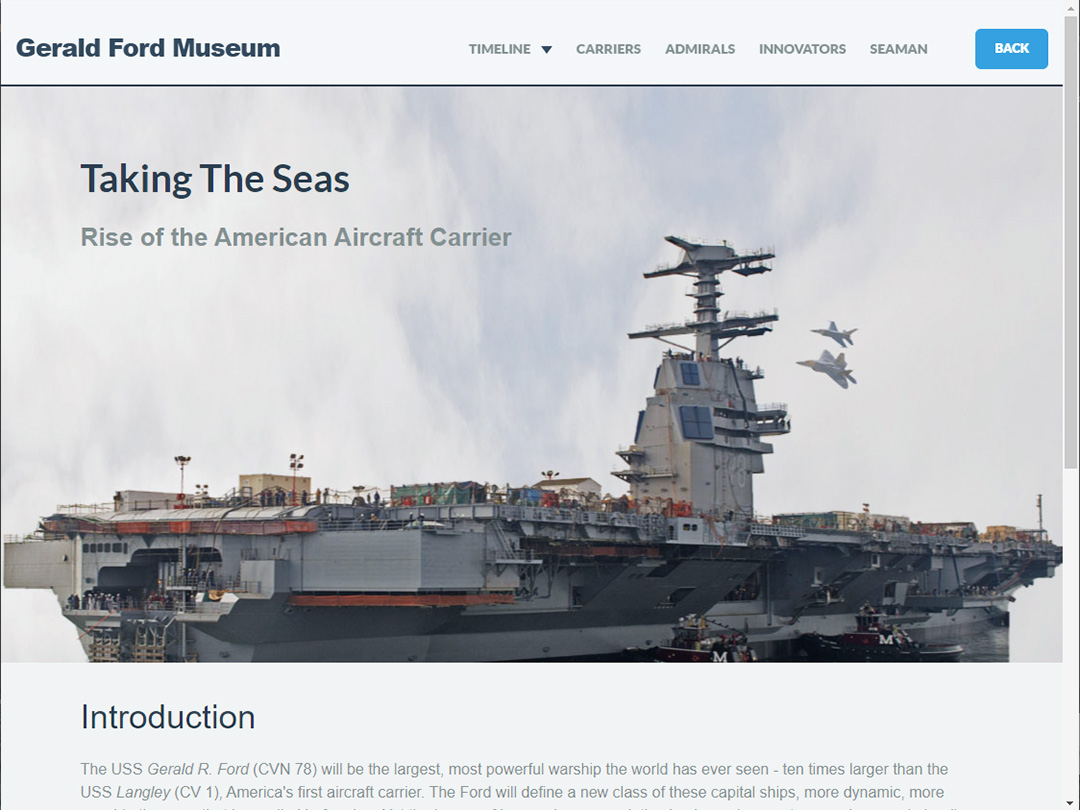
We currently are working on a brand new educational exhibit for the museum that will be launched to the public soon. These online exhibits are key to the museum's ongoing plan and, in essence, are separate mini-websites in their own right. They can be accessed either via the main musuem site or directly using a specific exhibit URL. This new "1976 Presidential Election" exhibit covers the Ford campaign from the time he announces his candidacy, through the 1976 Republican primaries and convention and all the way to the end of the general election. The site contains a lot of great content but the presentation is visual, with tons of wonderful archival photos, and is very easy to follow. The structured menus within the site allow a user to quickly select those aspects of the campaign that they want to dive into and explore in more detail. This is our second online exhibit for the museum. A few years back, we created an exhibit titled "Taking The Seas" which was about American aircraft carriers. There is a lot of fun information to explore in both of these exhibits. I hope we have the opportunity to collaborate with the museum on more of these exhibits going forward.